Card Cavern Case Study
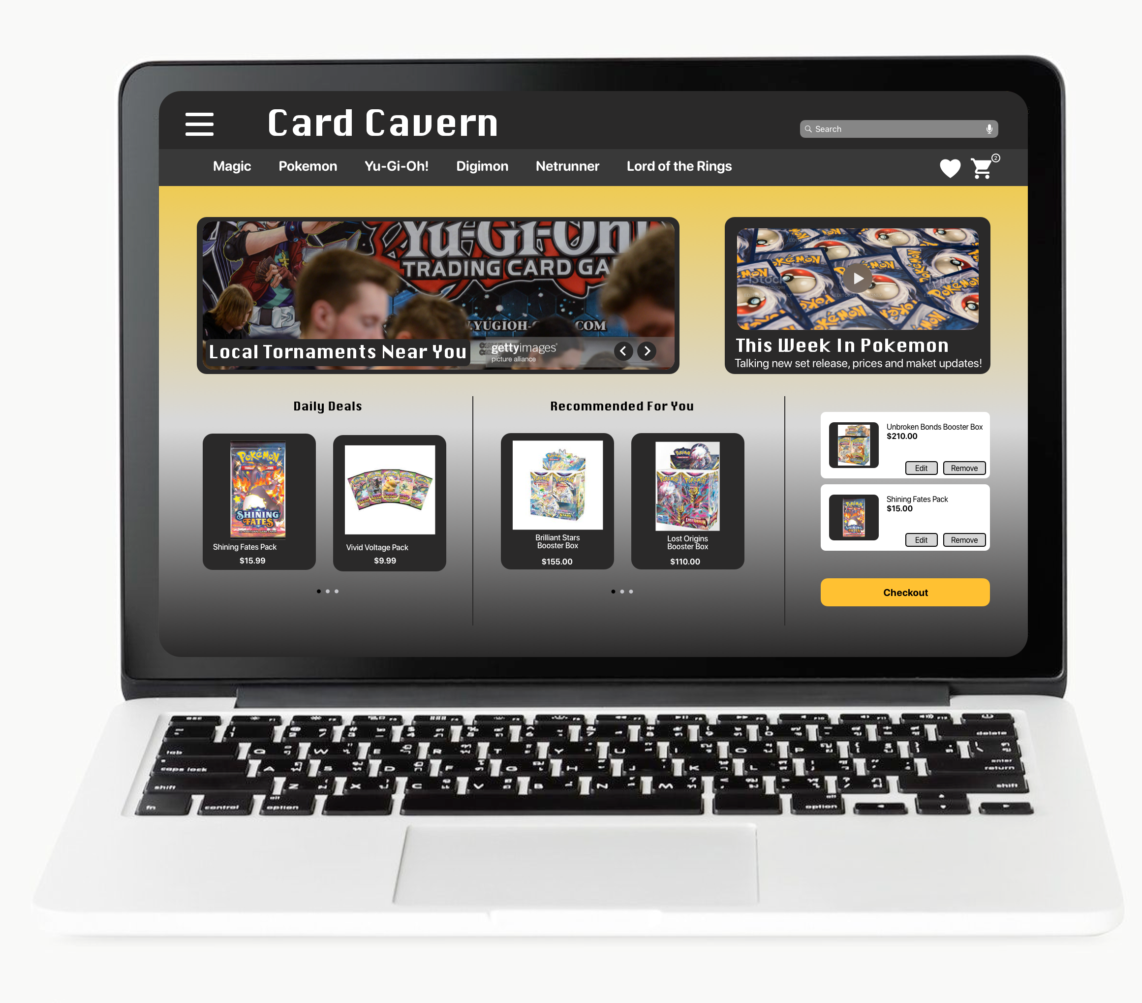
Card collectors and tcg players will be the main customer of this online store. You will be able to filter by different types of trading card games. This app/website will be used in the customers free time when they are thinking about adding new cards to their collections or decks. They will easily be able to shop where ever they are. As time goes on, physical card stores are dwindling and are rarely in most people’s town or city. We have come to facilitate the need.
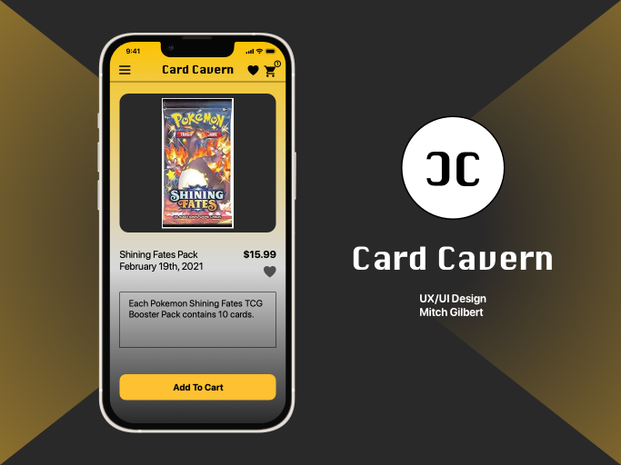
Research
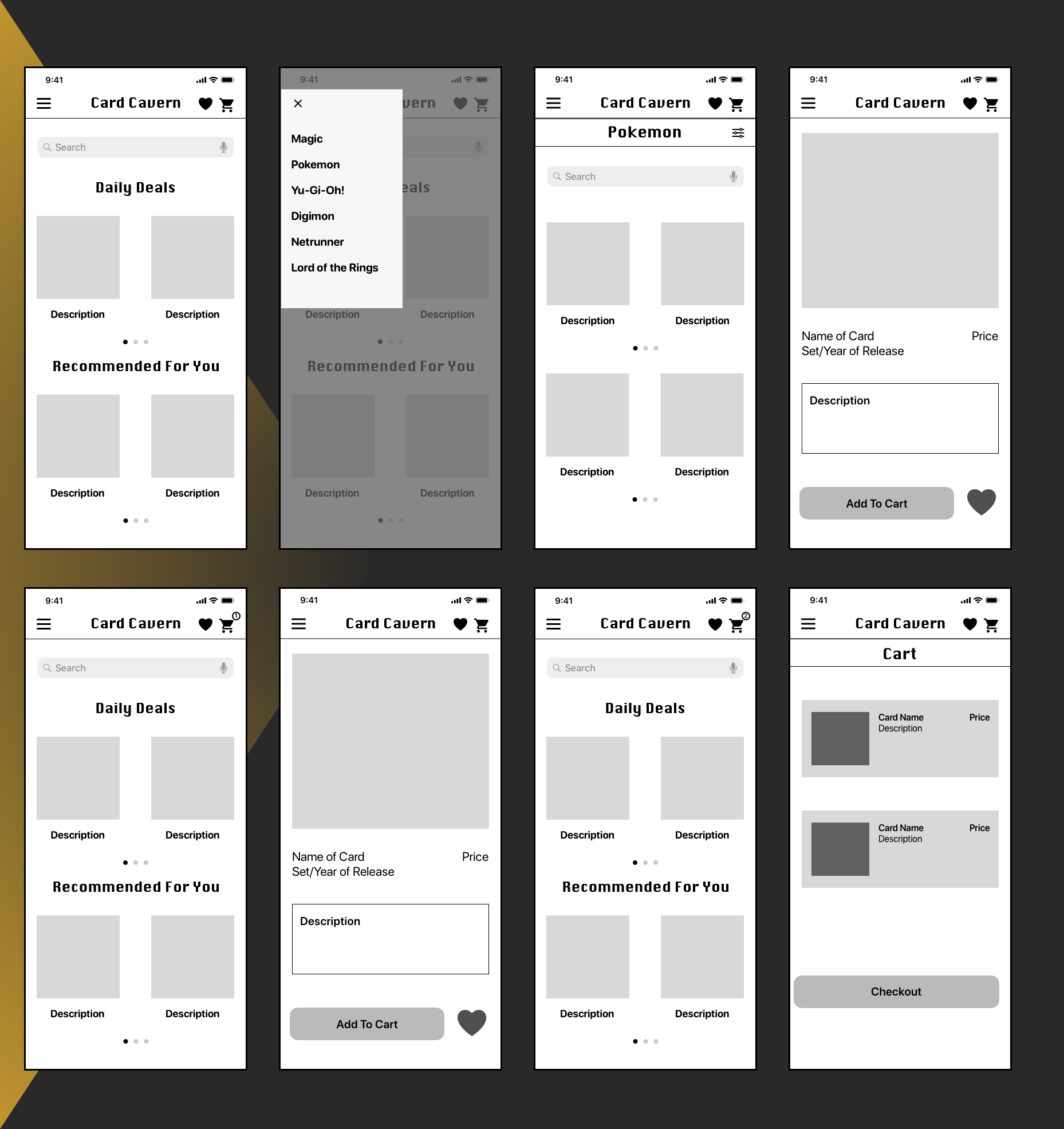
I created a prototype of my mid-fidelity wireframes using InVision. I kept my test focused by having your users only try to complete a single scenario. I wrote a recruitment message via Slack message to three people that are fellow students, that's brief and polite, providing testers with the prototype link, the scenario, and any other key information. I wrote out notes from your user tests in the form of observations. Using the results, propose suggestions for your designs. This will be a useful deliverable to include in your portfolio as it demonstrates how you approach testing and incorporate user feedback into your designs. Based on my results and suggestions, I implement changes to my design as I developed my high-fidelity wireframes.
Ideation
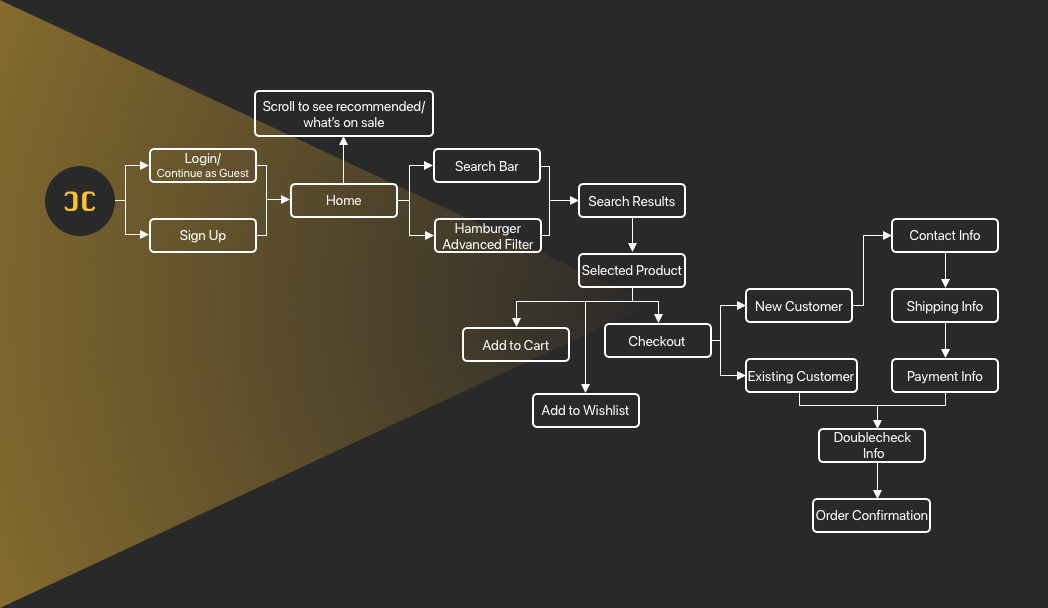
User Flows are as a customer, I want to be able to place multiple items in a shopping cart, so that I can purchase more than one item at a time. As a returning customer, I want to be able to save items that I cannot buy to a wish list, so that I can purchase them at a later date. As a customer, I want to be able to see when stock is on sale, so that I can save money. As a frequent customer, I want to see recommendations of products I may like, so that I find items I might not otherwise on my own. As a customer, I want to have access to advanced filtering options, so that I don’t have to browse through a lot of products to find what I’m looking for.
Wireframes
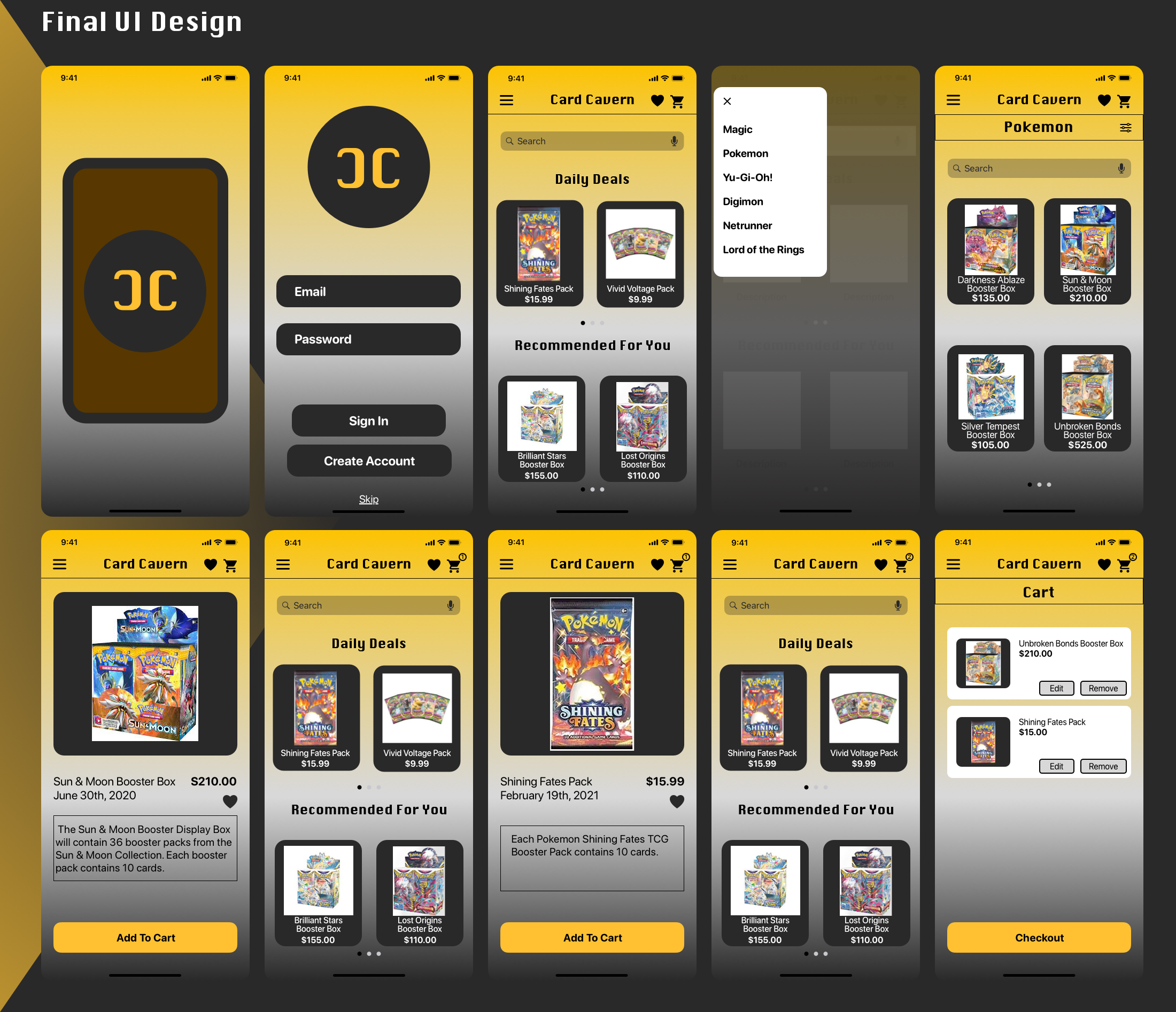
Design
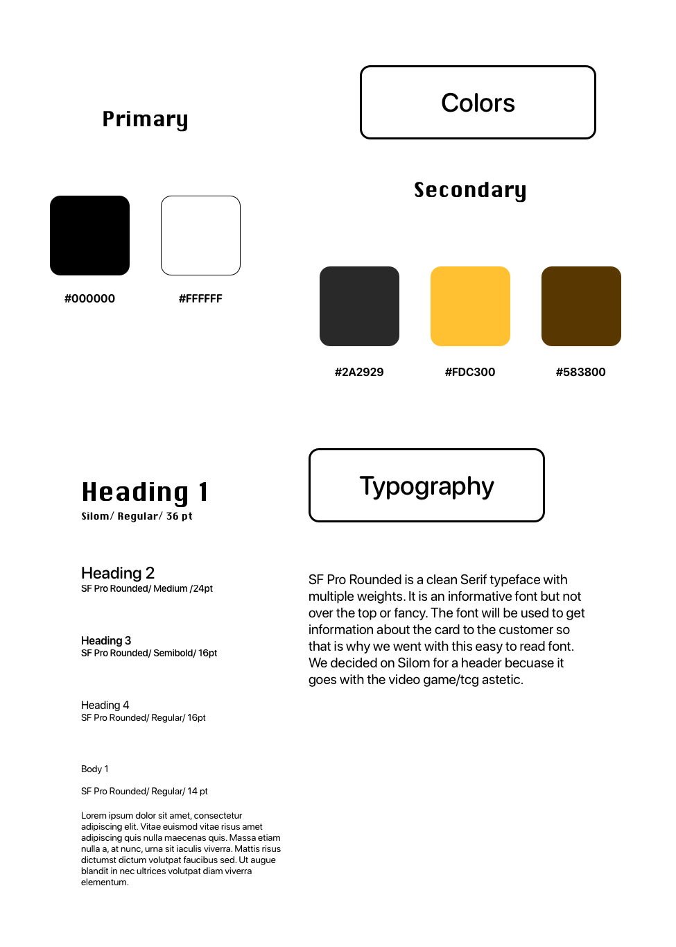
Prototype
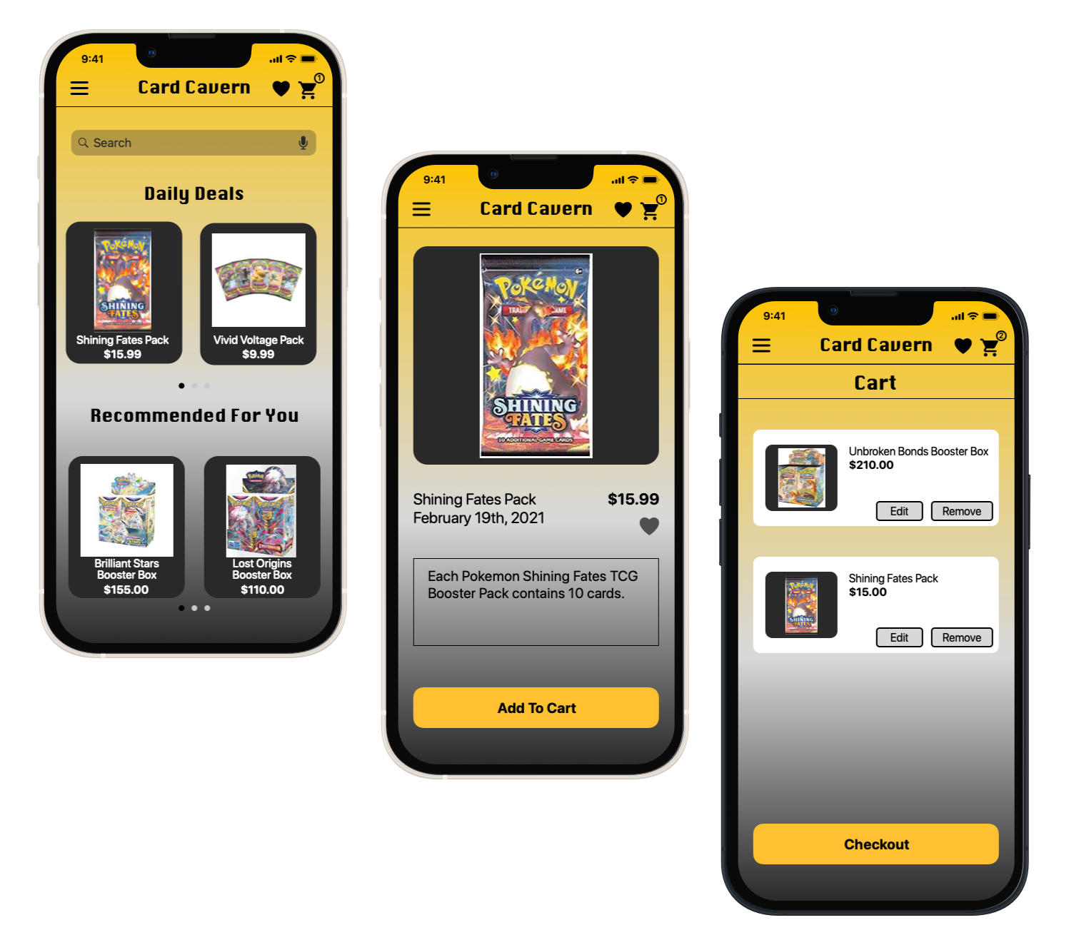
Conclusion
I created a product called Card Cavern, phone, tablet and desktop versions of a mobile app that responds to a specifc user problem. In this project I did both UX and UI roles. More spcifically, I took on the roles of market researcher, UX researcher and designer, while creating all of the final screen mockups. I think that the best insight that made the biggest impact on my final design was using Slack and getting peer reviews and critiques. It helped me hone in on a final design and what elements either fit really well or were slightly out of place. The only one I considered at the beggining was if I should have made the individual items smaller to fit more items on the screen but I feared that it would feel too cluttered.