Liquor Labs Case Study
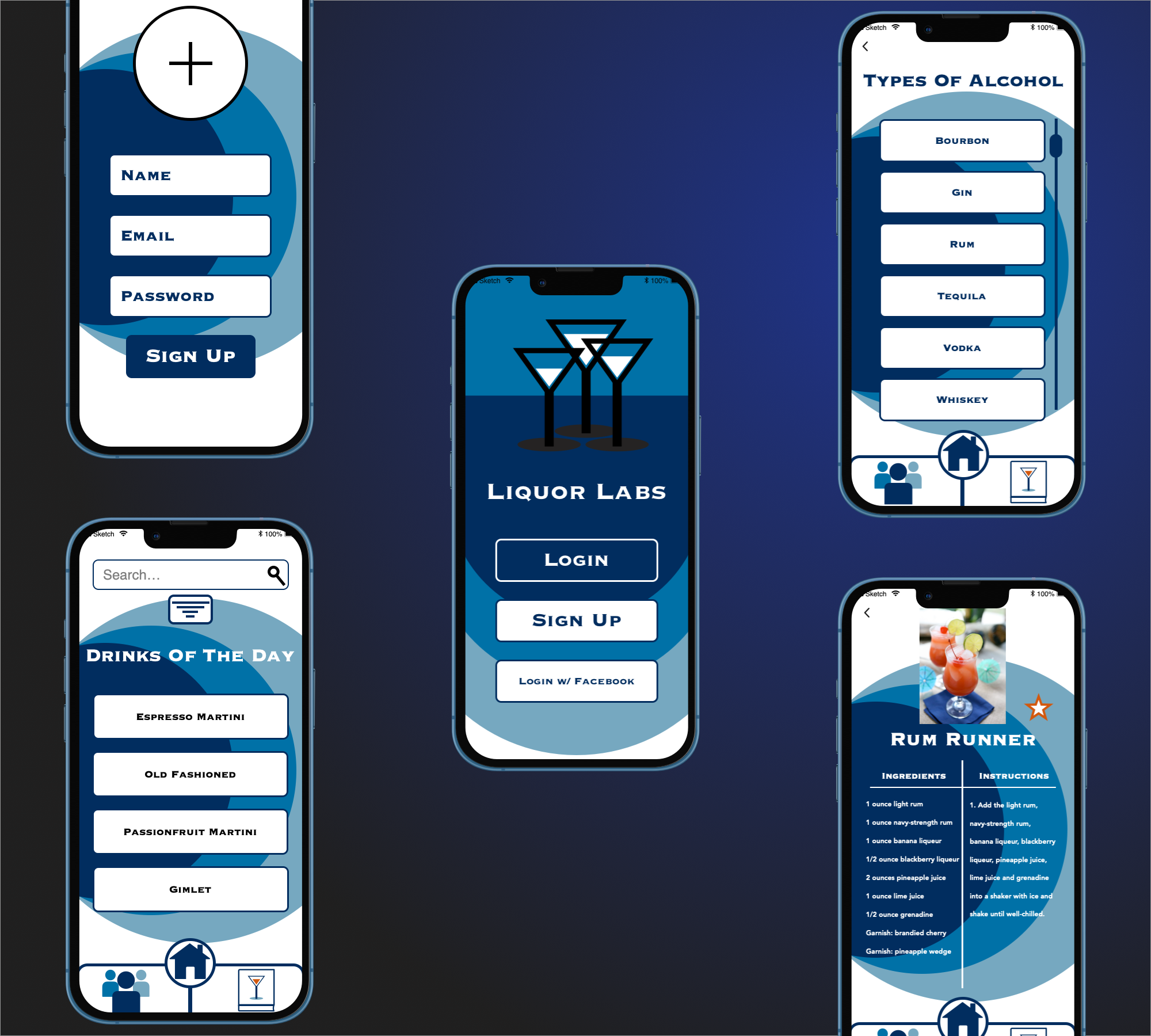
Liquor Labs is a responsive web app that allows users to find, save, add and share recipies with the community while making tasty and fun drinks that could be anywhere to a spin on a classic cocktail to unique and homemade drinks.
Research
Evaluating existing recipe apps helped me figure out what current oppertunities could be improved upon in existing apps and what strengths they had. Detailing weakness and threats was benifical in identifying what needed to be avoided and what potential threats existed that would help in the future of my drinks recipe app.

Ideation
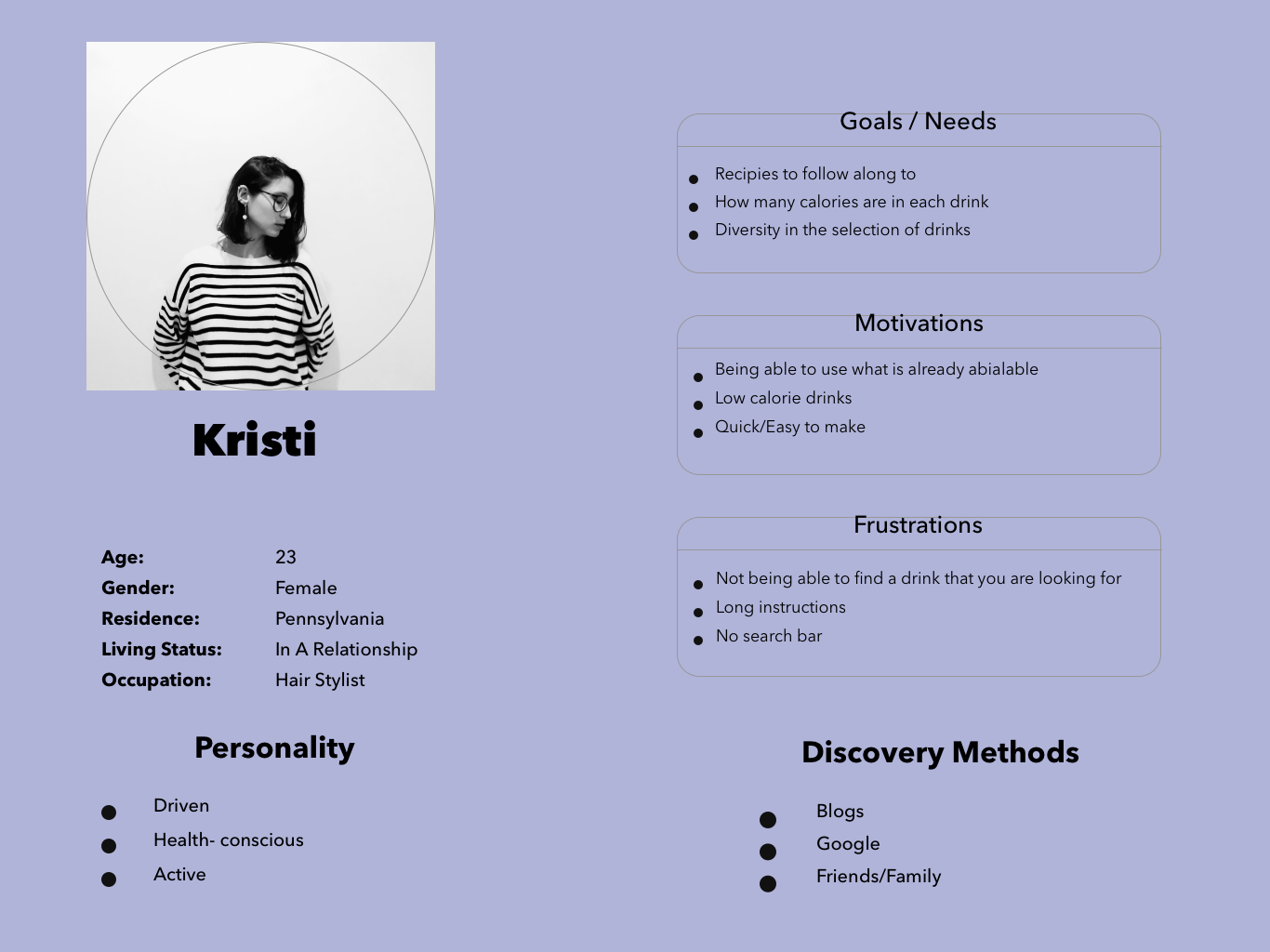
Conducting user interviews allowed me to have direct conversations with people who would use a cocktail and mixed drink app. It helped me identify kep points both good and bad about what the users would like to see and not see in the app. Identifying lots of informationwhile deciding the 5 W’s is essential in refining what is needed and what is not.
Wireframes
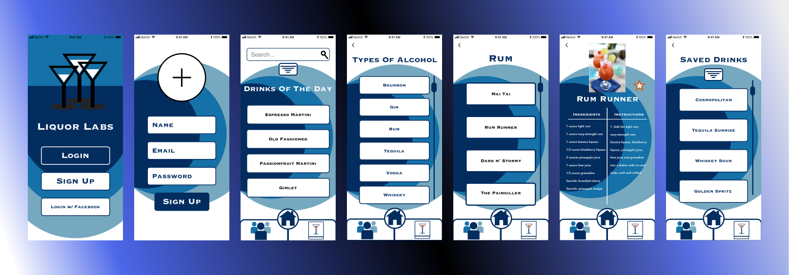
While deciding on the potential user flows, I tried a few differnt layouts but I have chosen this on because I think it wouldbe the easiest for the user to find their way through the app. I focused on a few of the JTBD to simplify the flow as much as possible.
Design
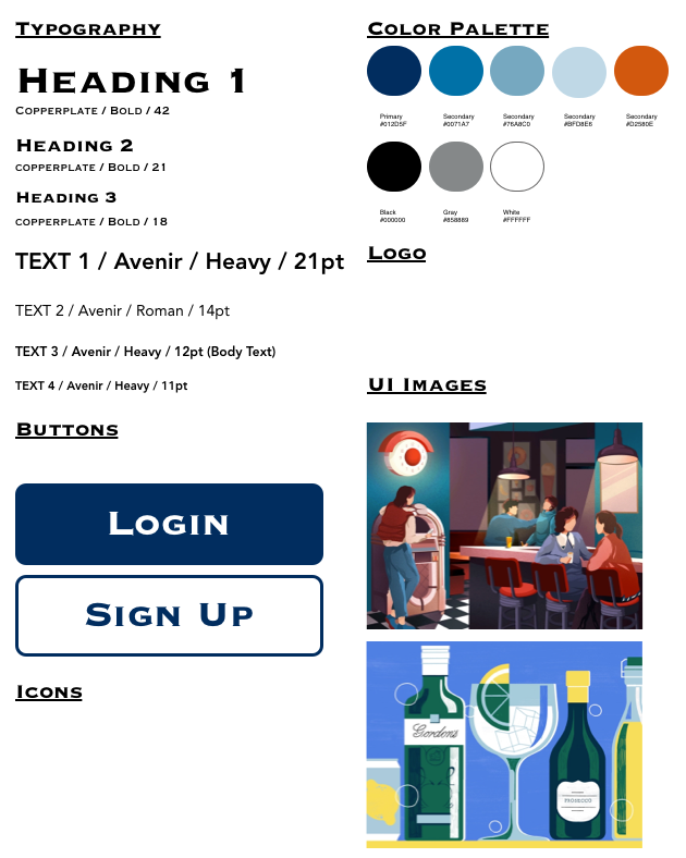
I went with this style and color pallete because it is centered around a more modern and fun take on a cocktail and mixed drink app. I was trying to go for a more clean and suave way to make it look as professional and enjoyable to look at.
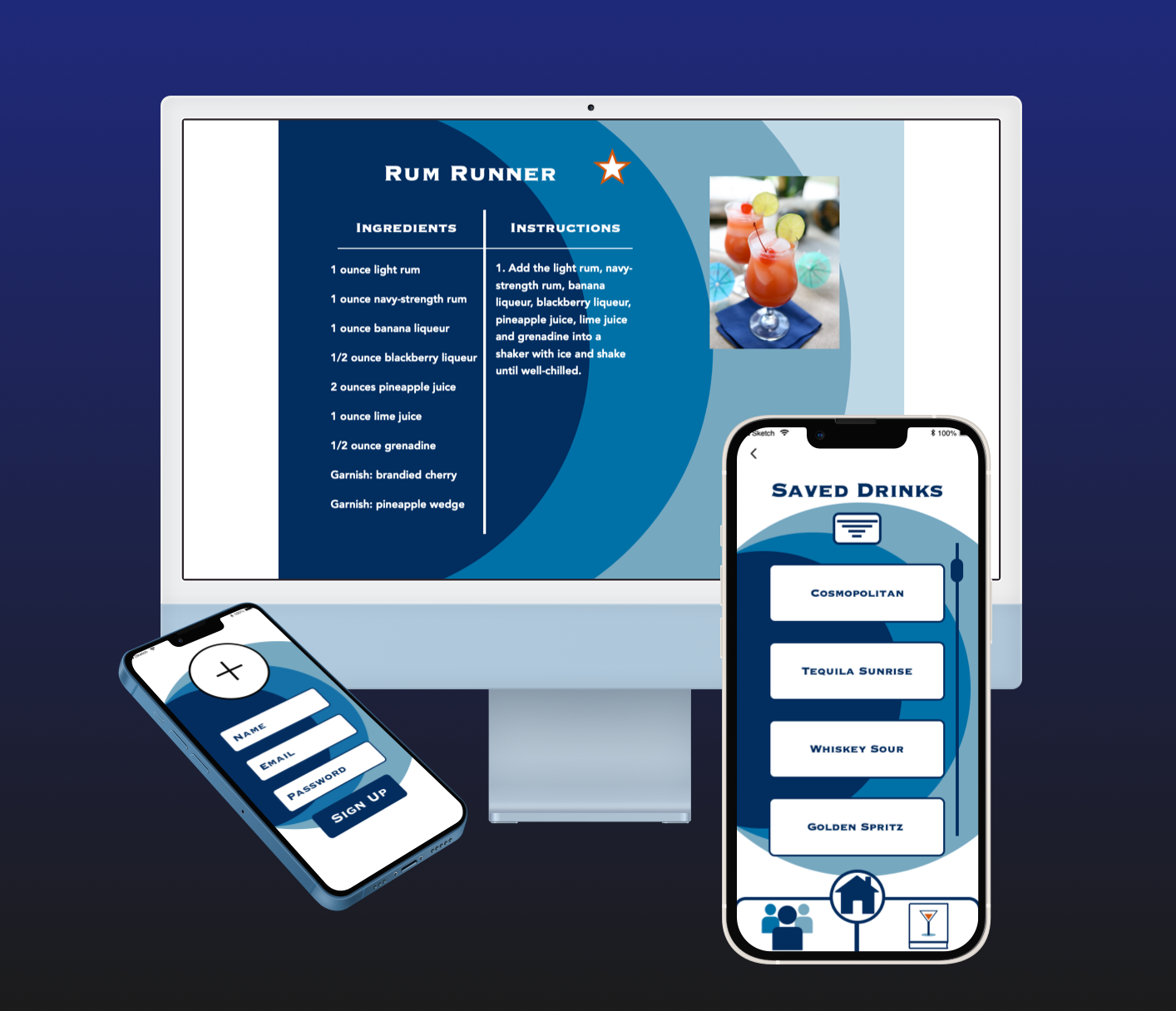
Mockup
Conclusion
I created a product called Liquor Labs that provides mixed drink recipes from all kinds of liqours that users can make drinks with friends and family that have easy to follow navigations and instructions. In this project I did both UX and UI roles. More spcifically, I took on the roles of market researcher, UX researcher and designer, interviewer, and data analyst, UI designer, conducting usability and preference testing, designing and creating all of the final screen mockups. I think that the best insight that made the biggest impact on my final design was using Slack and getting peer reviews and critiques. It helped me hone in on a final design and what elements either fit really well or were slightly out of place.